Things I learned from Paul Rand: 13 – Jan Tschichold
Things I learned from Paul Rand: 13 – Jan Tschichold
Years ago, my mentor, teacher, and boss, Paul Rand gave me a beautiful book on typography by master typographer, Jan Tschichold.
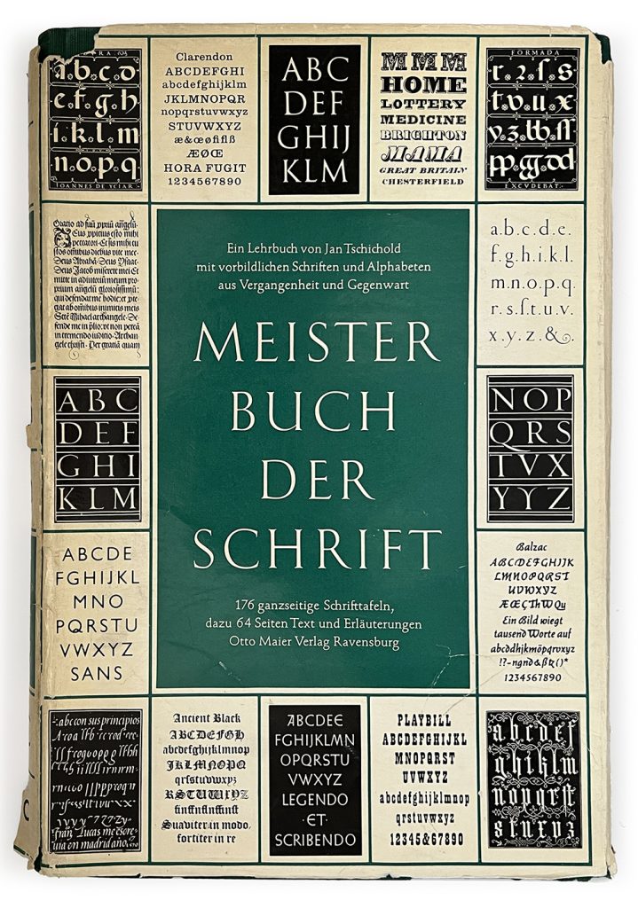
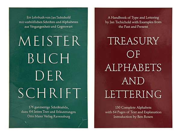
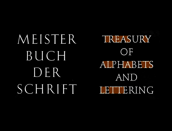
Meister Buch Der Schrift
The book was called, Meister Buch Der Schrift(Master Book of Letters), and it was in German. Paul had a large personal library at his house he designed himself in Weston, Connecticut. But an avid reader that he was, he didn’t always handle his books with utmost care. This book was also already beaten up when he gave it to me.
Front cover of "Meister Buch Der Schrift" by Jan Tschichold
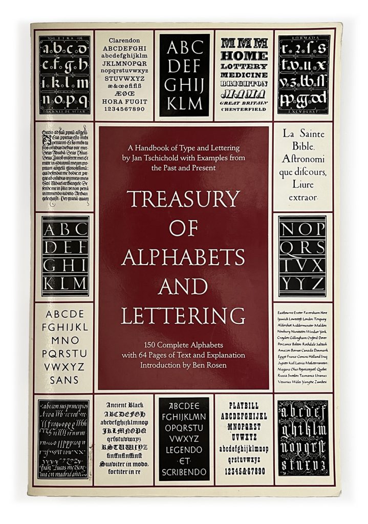
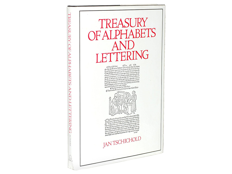
Since this book was published in 1952 and long out of print, I wanted to try to keep the book the way it was. Also, I wasn’t about to start learning German. So, I decided to look for a more recent paperback version that I can freely use without pressure, and found an American translated edition printed in 1992, by W.W. Norton.
Front cover of "Treasury of Alphabets and Lettering" from W. W. Norton
But I couldn’t help but notice the difference in the quality of typographical details used in the American cover.
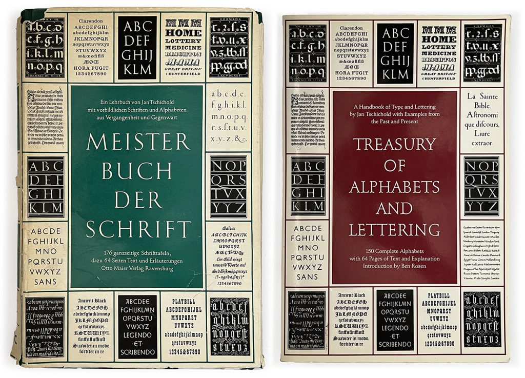
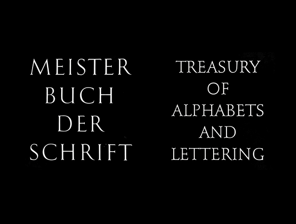
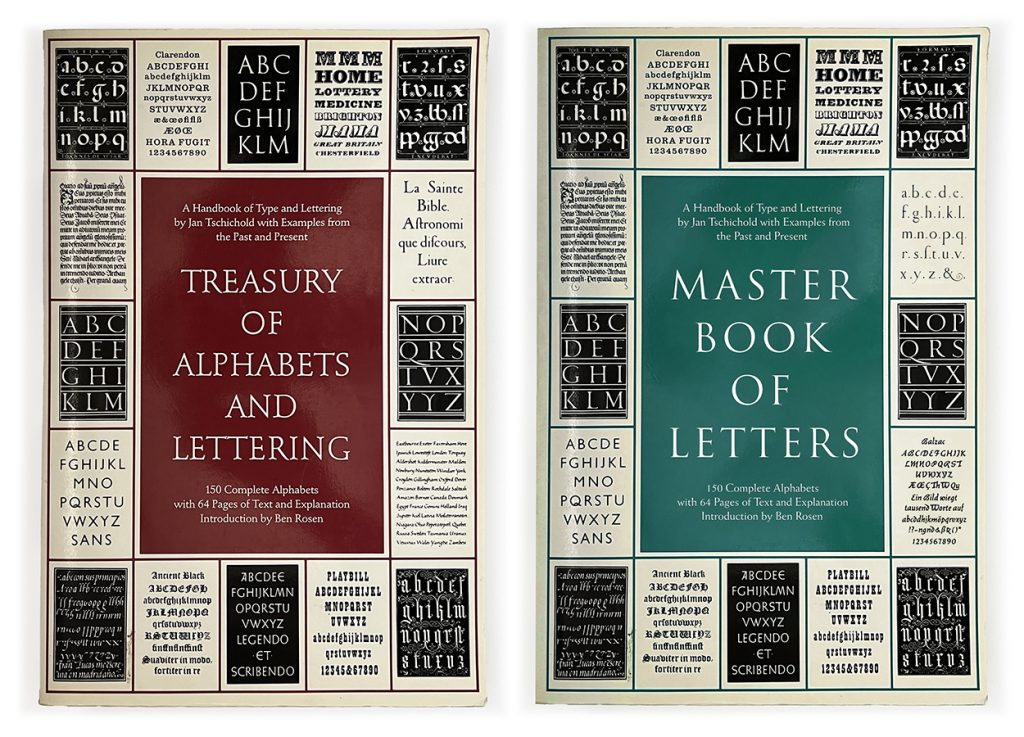
Two versions by different publishers from different times
The two book covers might look similar enough to an untrained eye (other than the most obvious details that one is in English instead of German, and one is maroon instead of green). However, a typographer should easily know better. Especially when you are publishing a book about high-end typography.
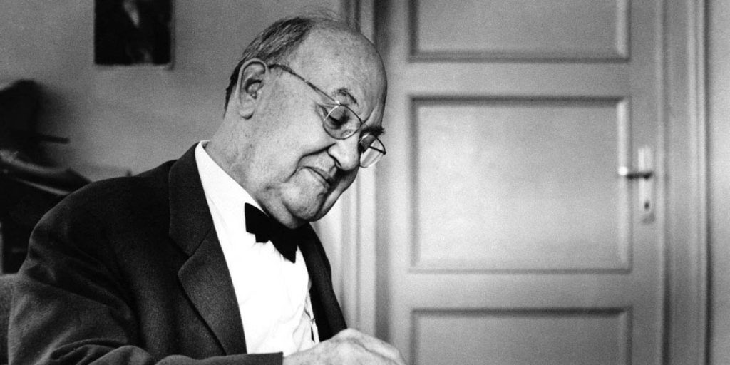
Master of Typography
After abandoning Modernist approaches he promoted in Die Neue Typographie, Tschichold became obsessed with classical typography. It seems to me he was aiming for the ultimate elegance and perfection in type layouts, even when he worked at a large publisher like Penguin Books. (He wrote a number of books discussing the fine details of this subject during his lifetime, which I recommend to seek to learn more about the subjects discussed here in depth.)
Jan Tschichold is widely regarded as one of the highest masters in typography. In this book, Meister Buch Der Schrift, Tschichold immediately opens the book with his golden rules: “Good lettering demands three things:
1) Good letters. A beautiful letter form must be selected which is appropriate to the purpose it is to serve and to the lettering technique to be used.
2) Good design in all details. This calls for well balanced and sensitive letter spacing and word spacing which takes the letter spacing into account.
3) A good layout. An harmonious and logical arrangement of lines is essential. None of these three demands can be neglected.
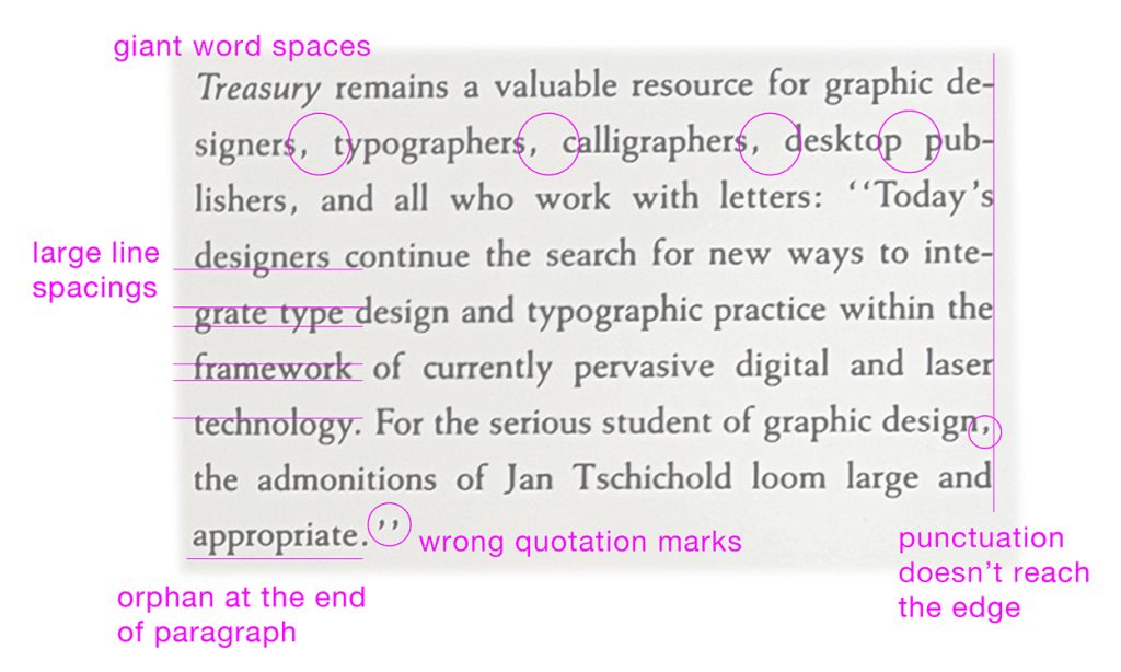
Somehow, W. W. Norton was able to break all three of these rules in the cover of their reprint. Let’s review this:
Good Letter forms
“A beautiful letter form must be selected which is appropriate to the purpose it is to serve …”
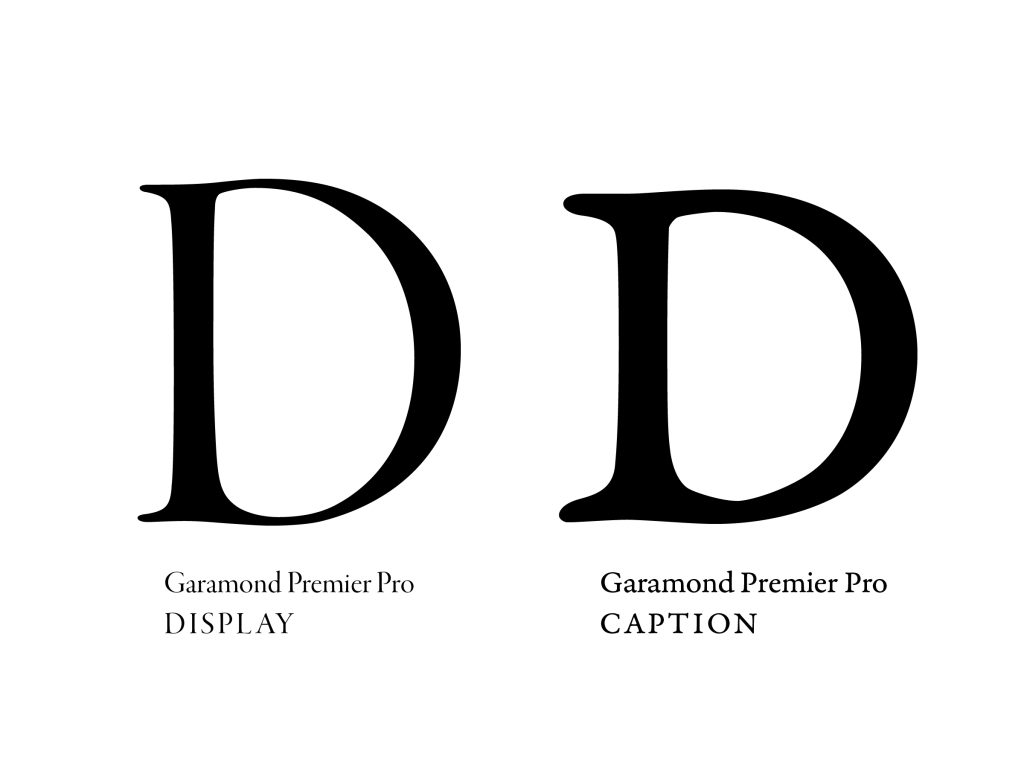
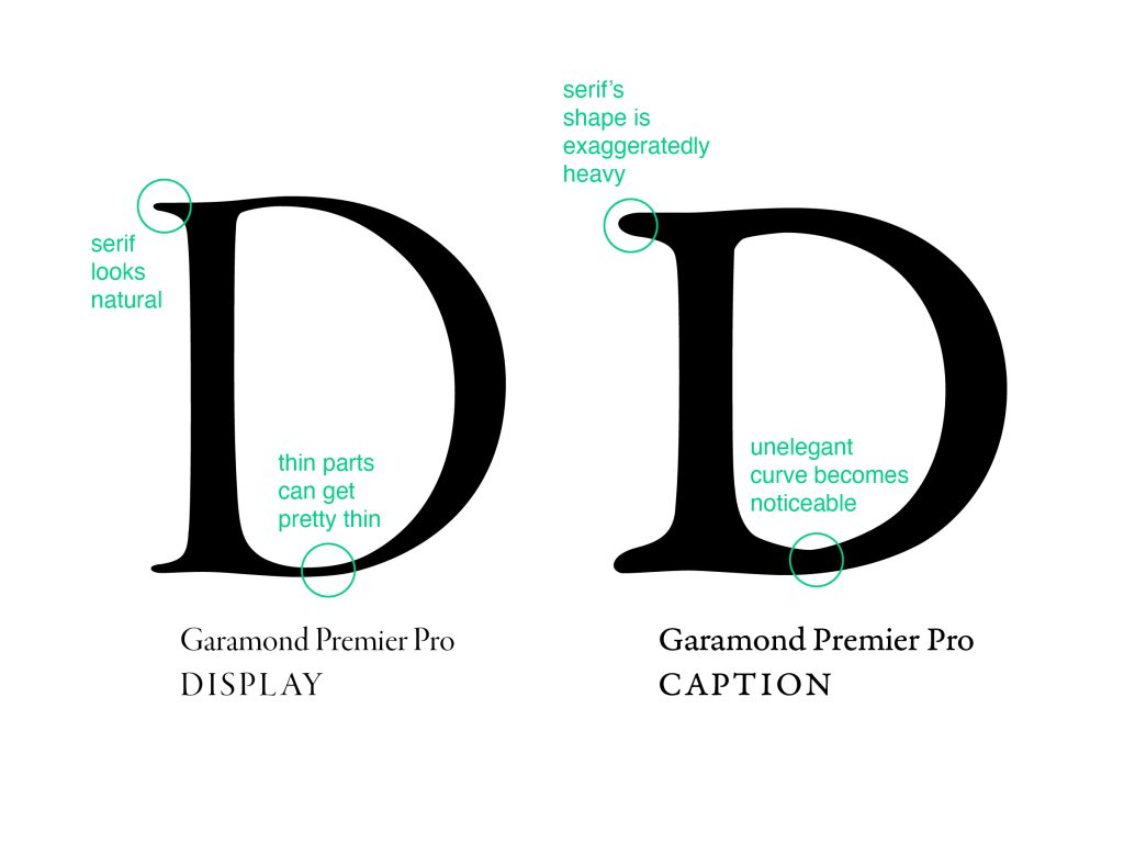
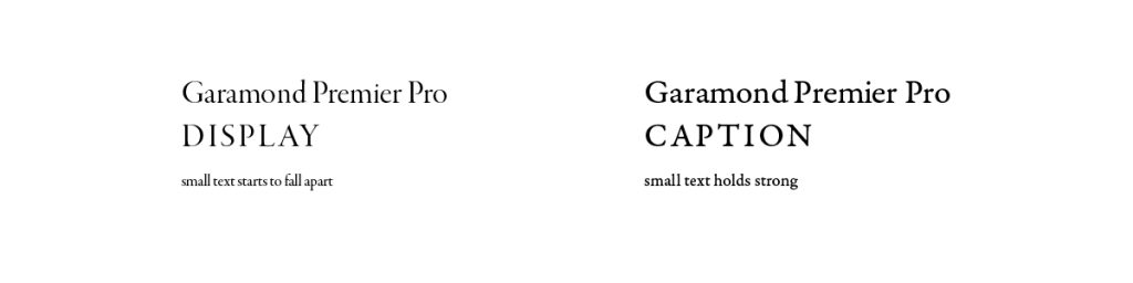
To start understanding a beautiful letter form, one must also understand fonts have purposes, and are traditionally designed differently for different uses. An elegant font at a large size often will not hold up at small caption sizes. Conversely, a font that holds up strong at a small size often look exaggerated and too heavy when used at large display sizes. For example, here are examples of Adobe’s Garamond Premier Pro:
Adobe created this font not only with multiple weights, but also with multiple size/usage in mind: Regular, Caption, Subhead, Display. This type of intentional separation is explained by designer Ilene Strizver in this article.
In a nutshell, some fonts that look great at certain sizes and look awful at other sizes.
Caption fonts look and feel heavy-handed at large sizes
Display fonts, with delicate details, are hard to read or print at small sizes.
Going back to the book covers, it is obvious Tschichold chose a display-type font, with fine serif details. Whereas the “designer” at Norton carelessly used either a regular text or caption font, with exaggerated serif thickness and shape.
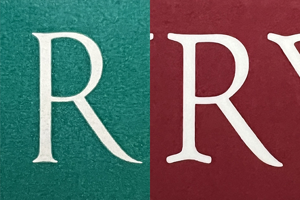
Tschichold's choice on the left, Norton's American version on the right
Good Letter Spacing
“This calls for well balanced and sensitive letter spacing …”
The idea of a good typography is similar to creating a good music: it’s about creating a nice and even rhythm. Visual spacing is very important, just like the spacing between the audible notes is.
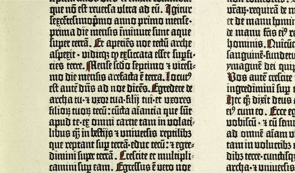
The lower case fonts have been designed to be spaced tightly since the Gutenberg days.
Image courtesy of fontfabric.com – tight and even spacings
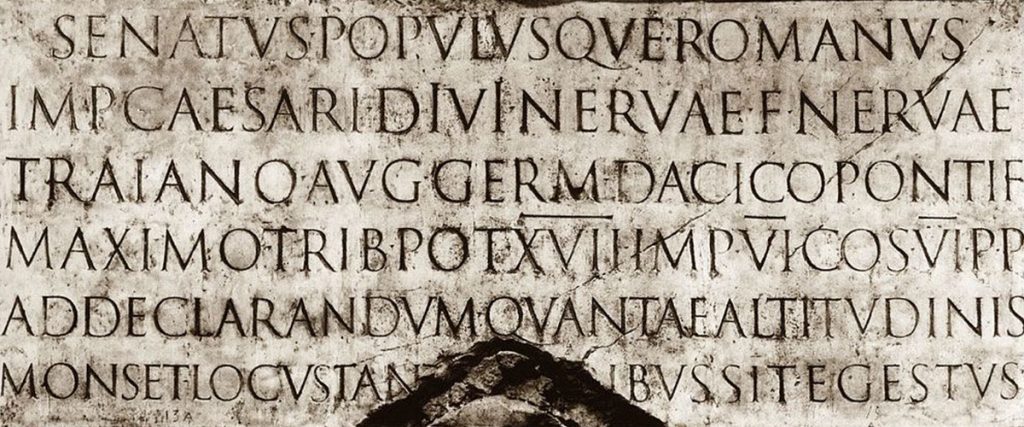
But the upper case fonts were designed to be spaced out more generously, as you can see from the Roman times. Otherwise, the large negative spaces in the letters become emphasized, making the text difficult to read, creating an uneven rhythm.
Image courtesy of historyofinformation.com – even texture throughout with beautiful letter forms
It is obvious that, while Jan Tschichold spent effort and time to choose wonderful scale and spacing in his headline, such care wasn’t spent on the W. W. Norton edition.
Tschichold's even rhythm on the left. Norton's clunky rhythm on the right.
The tighter letter spacing on the W. W. Norton version creates distracting large spaces between certain letters. This, combined with a poor font selection, is making this layout feel messy. Also outdated.
Good Layout
“An harmonious and logical arrangement of lines is essential.”
Tschichold was also a master at using a well-proportioned grid as the backbone of his beautiful layouts.
A spread from The Form of the Book (Russian version), image courtesy of Art. Lebedev Studio
In the back cover, you can really see the difference between the first edition and the reprint.
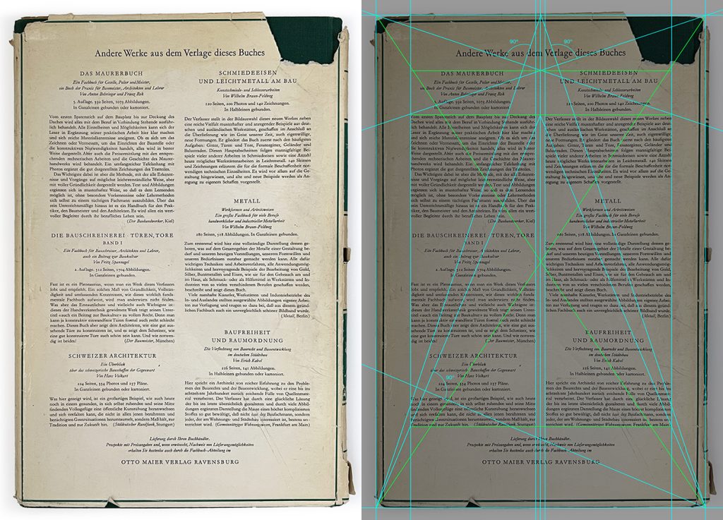
Meister Buch Der Schrift's back cover and its anatomy
The back cover of Meister Buch Der Schrift looks and feels solid. All the typographical elements belong. Upon analysis, one could find a sophisticated and wonderful network of grid system, holding the layout together logically.
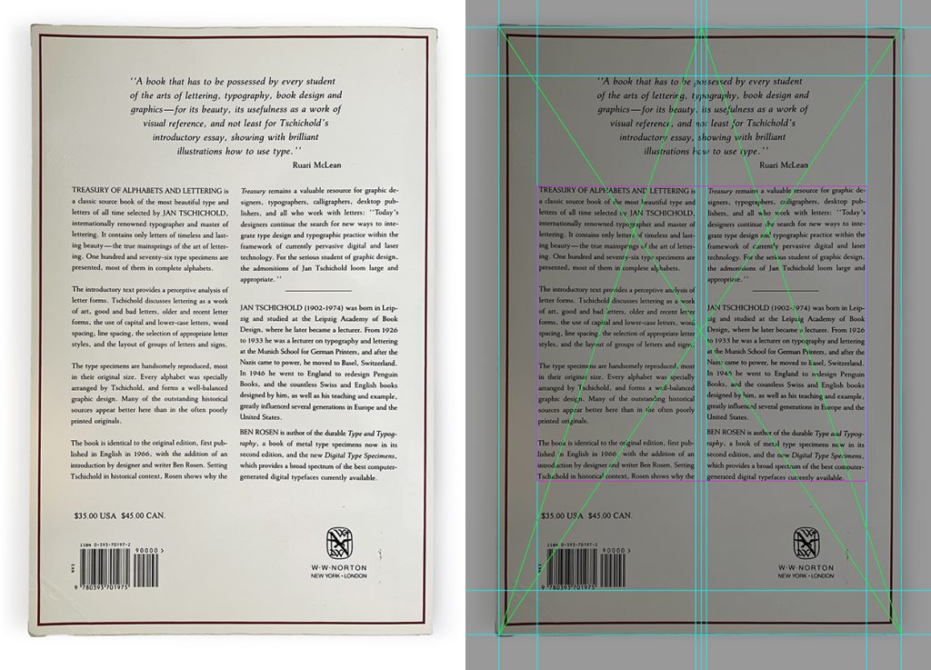
Treasury of Alphabets and Lettering back cover with no grid
On the other hand, one would struggle to find such grid in the back cover of “Treasury of Alphabets and Lettering.” It seems like they were placed more arbitrarily, and the designer is showing a lack of understanding of a good typographical architecture. Especially compared to the original, the typography feels weak and loose, like they are breaking apart.
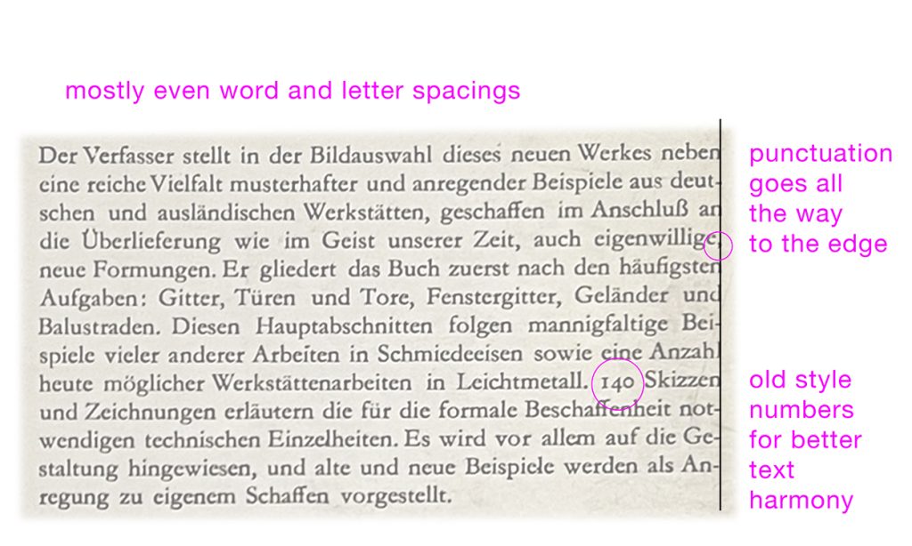
Spacing details even get worse when you inspect the 1992 W. W. Norton version closer.
1992 W. W. Norton's version – a lot of visual "holes"
Very poor typographical details. Generally speaking, the default settings of these types of digital applications (like Adobe InDesign) are set with huge word space settings while the letter spacings are tight, for some reason. These issues become very apparent when you try to justify the paragraphs.
1952 Tschichold's version – smooth and even
On the other hand, you can see Tschichold took the approach of tight line spacings, in order to achieve overall smoothness and evenness in type texture. I’m guessing he also used a lot of hyphens because he prioritized even spacings. Funny the W. W. Norton version also inherited this abundant use of hyphens, yet they didn’t achieve evenness in spacings at all.
Is Typography dying (again)?
Just because something is newer obviously doesn’t mean it’s better. But the 40 years of difference is showing a noticeable decline in these examples. However, I do have to give some kudos to the staff of the 1992 edition, after discovering the 1985 version from Omega Books.
1985 Omega Books version, photo courtesy of Amazon
At least the staff at W. W. Norton tried to mimic Tschichold’s original design. But here, you can see how the 80s was possibly even a tougher time for classical typography.
If W. W. Norton or any other publisher every thought of reproducing this fine book again, I would recommend looking into finding a more elegant and well-drawn display font, space the letters and lines out appropriately, and place them in a more careful layout. I also don’t know what made the shift to a maroon color from green. (Perhaps Marketing study of average audience’s color preference?) Also, the longer translation of the title isn’t helping, a typographer would prefer one that works better for a more powerful layout (which would seem to be of a higher importance for a book about typography):
Just a suggestion from the author of this article
To be fair, something is always killing typography. Paul Rand had also discussed this type of topic in his book Design Form and Chaos published in 1993. Even going back to Roman times, I have definitely seen some letter carvings that were far inferior to some of the best examples from the same period. What was the reason? Talent? Economical pressure?
Johann Gutenberg’s obsession to his craft left him in lifetime of debt, he lost his own print shop and died a poor man. People with less interest in artistic perfection but more emphasis on profitability and efficiency who took over proved far more successful. Commerce tend to outgun art.
Typography took a step back with early desktop publishing, from limitations of software applications (remember Aldus PageMaker?). Then, now that printing is in decline, the limitations of HTML has been killing typography. Even though the technology of the world wide web has come a long way, I have to admit, I feel like I still have very limited control over the layout in this very article, for example. There is no guarantee which font people would be reading this with, at what scale, on which browser, in which proportion. The rag on the right side could be quite random.
But that’s where I also do see a possibility and a room for improvement. If aesthetics could become a stronger part of coding decisions, perhaps typography can live another life again. Like Tschichold was able to breathe life into Penguin books, I don’t see why similar can’t happen with web pages.
Also as a fan of traditional typography, I would like to see the writings and collections of such master like Tschichold, see themselves be reprinted and preserved in appropriate ways.