Paul Rand is famous for designing the IBM logo. They state on their own website, “In 1956, Thomas J. Watson Jr. — who had taken over IBM from his father … hired noted graphic designer Paul Rand to create a logo that would herald a new era of IBM while also communicating continuity.“
But was it really so?
Generally Accepted History
Generally, it seems to be known that the company started with a merger (between International Time Recording Company, the Computing Scale Company, and the Tabulating Machine Company) that became the Computing-Tabulating-Recording Company in 1911. In 1924, Thomas J. Watson Sr. renamed the company, International Business Machines. Two decades later, they “modernized” by shifting from punched card tabulating machines to computers, and “IBM” logo made a debut in a typeface called Beton Bold.
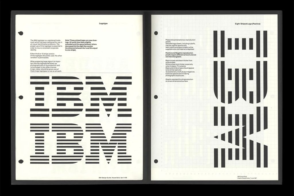
Thomas J. Watson Jr. then took over in 1956, and hired Paul Rand (through Eliot Noyes) to redesign the logo, when it became the City Medium version. The 13-stripe and 8-stripe versions were later added in 1972.
However, this wasn’t exactly the way it happened, according to Paul.
Wasn’t Hired to Design the Logo
One day, when I was chatting with Paul about his famous IBM logo, he mentioned something that was rather shocking to me at the time. He said the IBM logo was something he did on the side when he was hired to design their annual report. He was frustrated that they were still using their old name International Business Machine Corporation throughout, which was annoyingly long. So he decided to just use IBM throughout. But because of this, they got the logo for free.
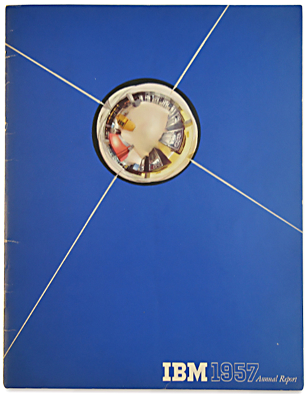
IBM 1957 Annual Report Cover with a "free" logo
A Little Bit of Mystery
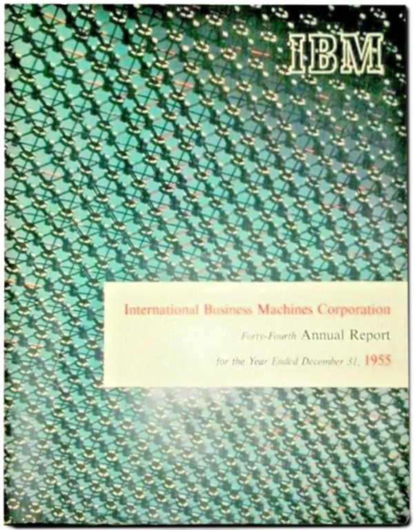
Now, this brings up a little bit of a question. There was a Beton Bold version of IBM logo that had been used since 1947. Unless Paul somehow also designed that version while working at Weintraub Agency (where he worked from 1941 – 1955), they were already starting to present themselves as IBM, although, they still seem to have been identifying themselves as International Business Machines Corporation in their annual reports and advertisements along with the logo.
1955 IBM Annual Report Cover – the long name is still in the title
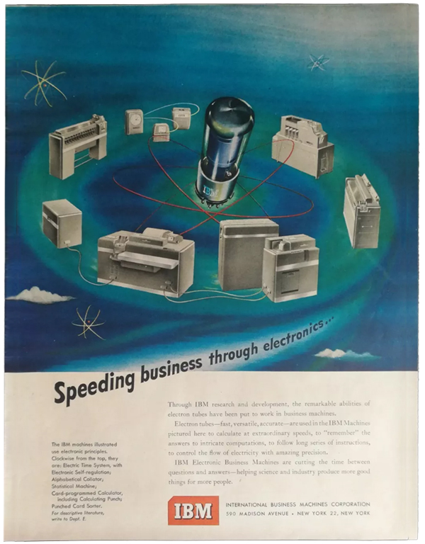
1950 IBM Advertisement – the long name is still next to the logo
So Long, Long Name
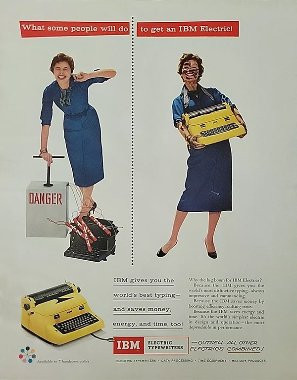
Starting with the 1957 Annual Report above, it seems like the International Business Machines name was largely deleted from printed matters, including this Electric Typewriter Ad also from 1957. Perhaps Paul was talking about how he was able to end them from using their long name, and forcing them to fully commit to being IBM as a brand from there on.
1957 IBM Electric Typewriter Ad
Good Business
Paul sounded like he was initially disturbed that the IBM logo became so well-known, when he didn’t get paid separately for it. But he happily told me that he “more than” made it back when he revised the logo years later as a consultant, and created their identity program. I think he was talking about the graphic standard manual he created in the 1970s.
It is said Thomas J. Watson Jr. coined the phrase “good design is good business.” Indeed, Mr. Watson. Indeed.