Things I learned from Paul Rand: 10 – Design Preferences
Things I learned from Paul Rand: 10 – Design Preferences
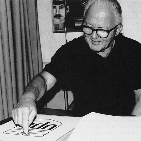
August 15 was Paul Rand’s birthday. Here are some design elements I will always remember him by.
Particular
Paul Rand was a very particular person. He demanded aesthetic qualities in everything he surrounded himself with, whether they were furniture he lounged on, house he lived in, clothes he wore, car he drove, or utensils and dishware he ate with. He also had strong preferences when it came to the type of music he listened to, books he read, or food he ate. He was very specific about the art he collected, as well as the art he created. Then, he definitely had design style and elements he favored.
Fonts
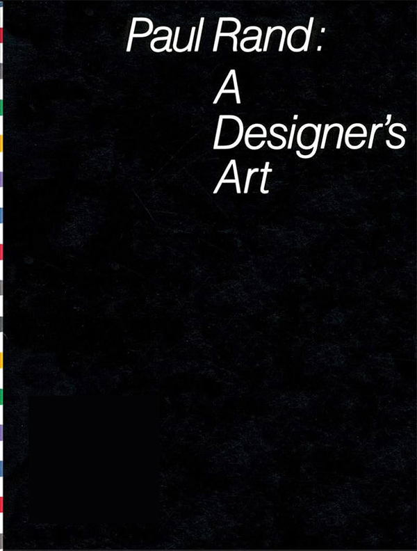
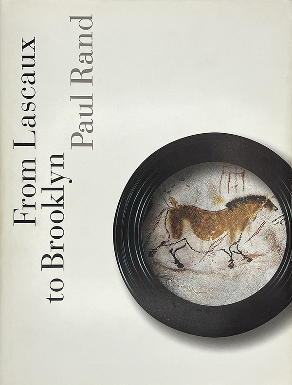
Paul, at least near the end of his career, wasn’t big on exploring many font choices. Although with his last book, “From Lascaux to Brooklyn,” I do remember us trying several different options before settling. But even then, he seemed to have a clear idea in his head what style he was looking for. (Didone fonts for you type nerds.)
Here are some of the fonts he liked and used:
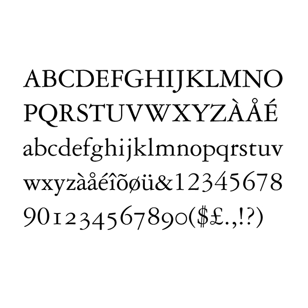
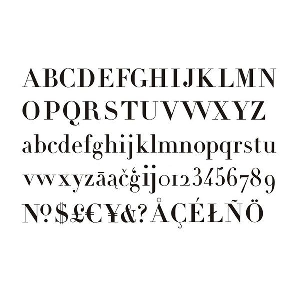
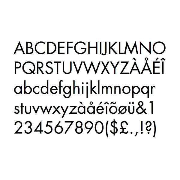
Garamond 3: Out of all the Garamonds, Paul preferred this version with tall x-height
Caslon 540: Paul also preferred this Caslon with tall x-height
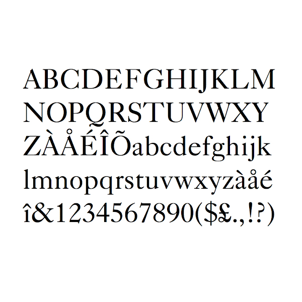
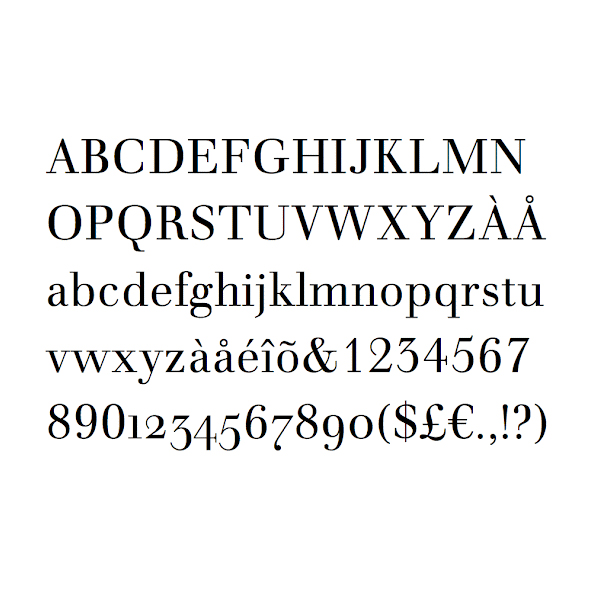
Bodoni: Paul liked these Didone fonts with narrow and unbracketed serifs
Didot: This was the French version of Didone font, which he also liked
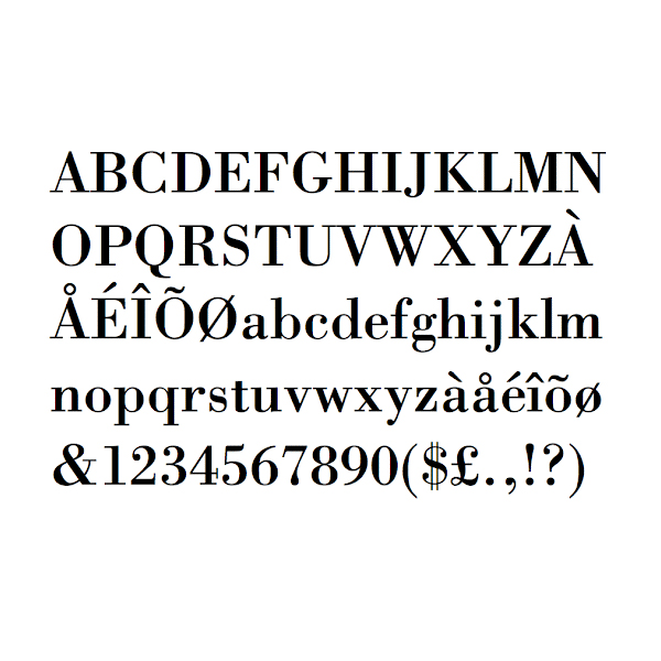
Walbaum: This was perhaps his favorite Didone font, with refined elegance
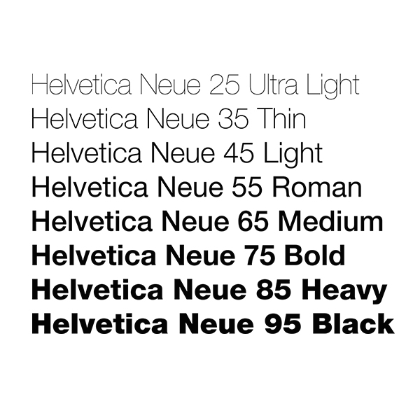
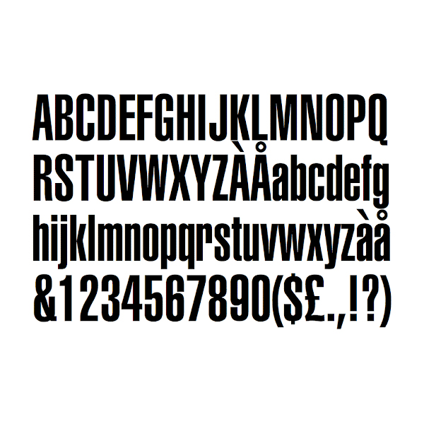
Helvetica Neue: "There is nothing wrong with Helvetica" – this font was frequently used
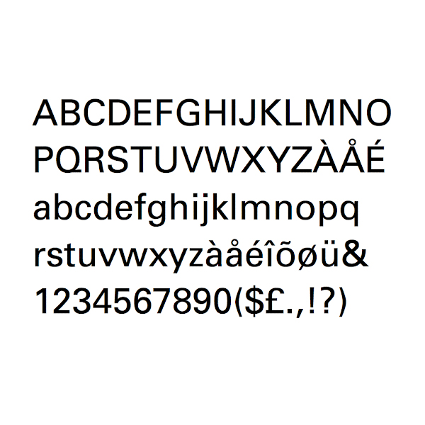
Univers: Very similar to Helvetica, but for a slightly different feel
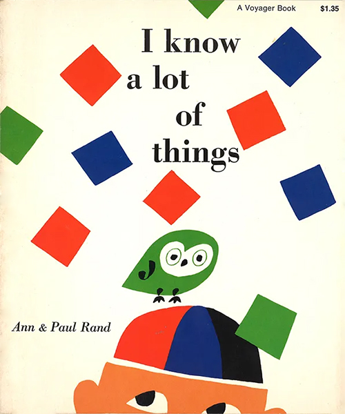
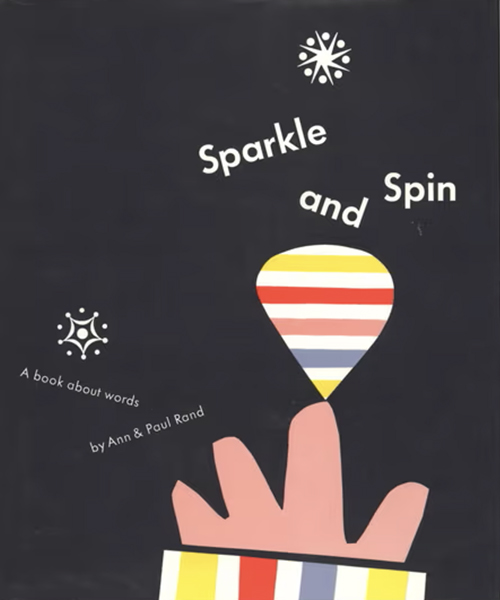
Futura: Paul seemed to have used these a lot on his children's books in the past
Helvetica Ultra Compressed: When he needed a very narrow font, he usually started here
Univers Oblique: Laid out in classic Paul Rand style for Steve Jobs
Helvetica Neue Italic: Bold and simple
Walbaum: Paul also looked into others, but Didot had a strange "a" and Bodoni felt a little heavy
Bodoni: Unlike many serif text fonts, Didone fonts work well at large sizes
Futura: Geometric nature of this font perhaps fit Paul's children's themes
Colors
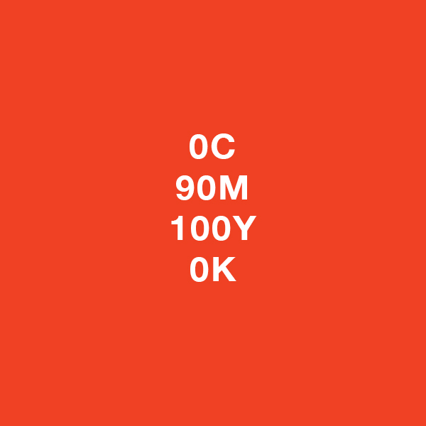
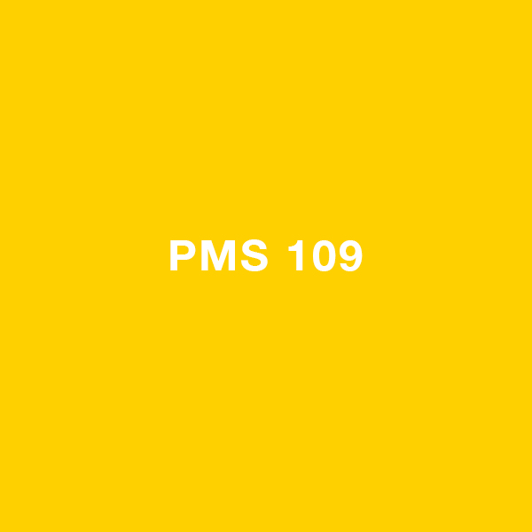
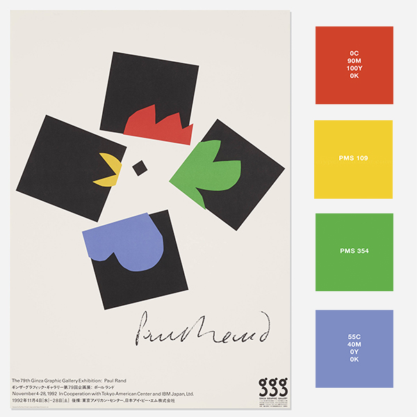
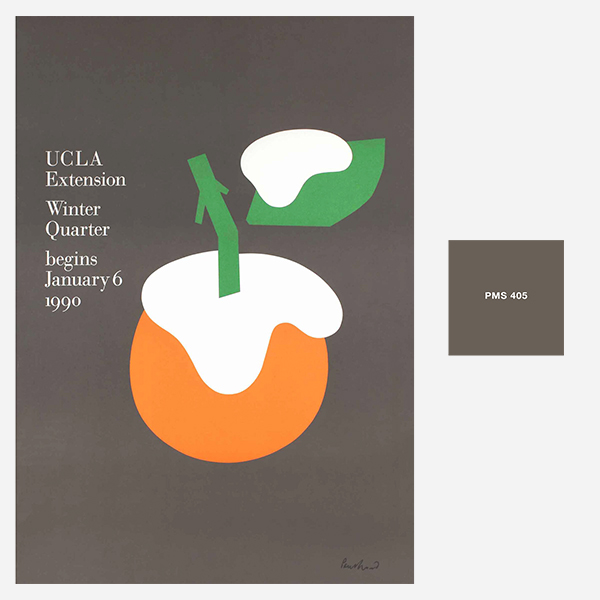
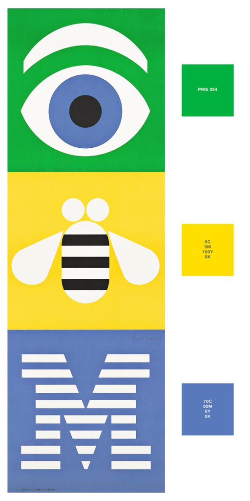
Paul also had a rather specific color palette he went to for most of his work. With some colors he was happy with the Pantone options. But with some, he preferred to use CMYK breakdowns. The color I remember him struggling with the most was the blue. He seemed to never be completely satisfied with neither what Pantone or CMYK could create. Nonetheless, here are some common colors we used when I worked for him:
His red was also on the warmer side
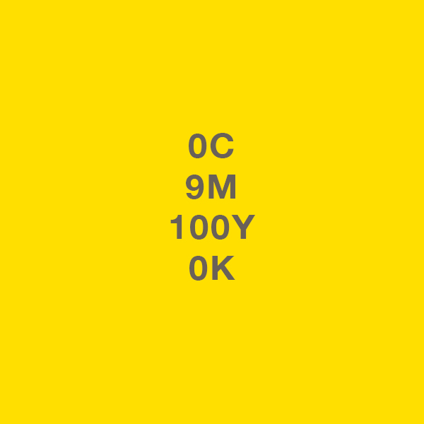
Paul preferred warm yellow
Even with lighter yellow, he preferred a bit of warmth
This was his go-to green
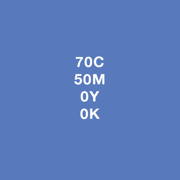
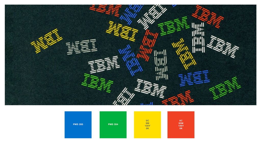
I believe this was the IBM Blue earlier
Paul often made tweaks to his blues
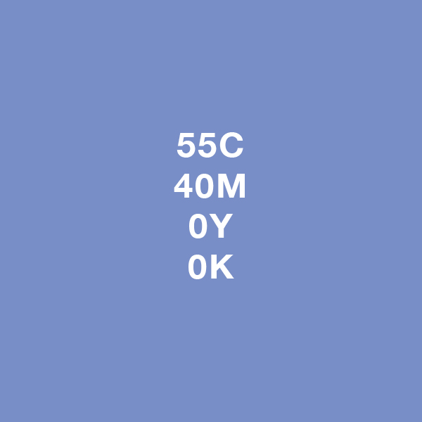
This was another type of blue he used
With gray too, he preferred warmth
IBM blue was later updated to Pantone 2718 in the 90s