Before Paul Rand became widely known as the father of corporate design, he was a hot shot art director with a signature collage style. But he once told me it was more of a necessity than choice.
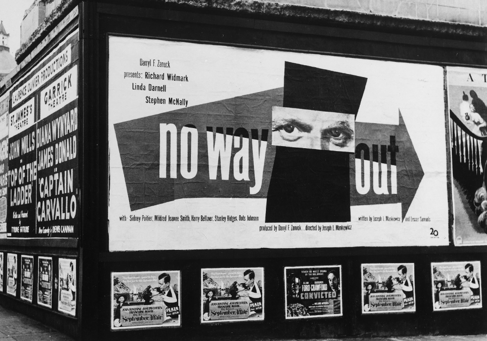
You can especially see from surrounding posters how groundbreaking this design really was
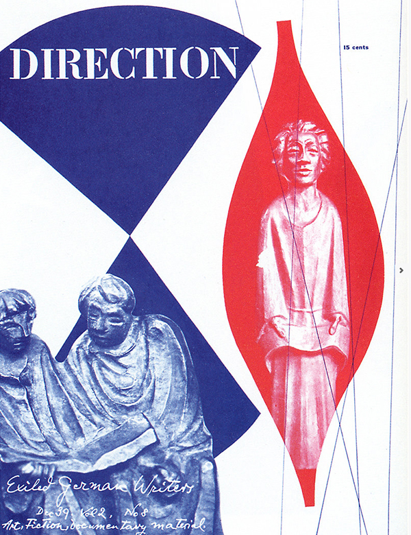
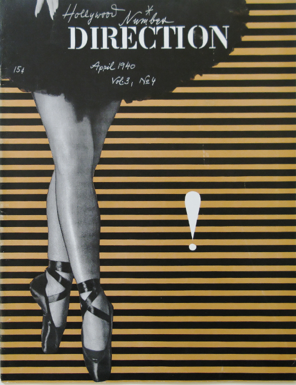
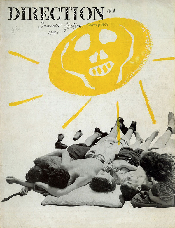
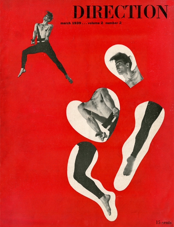
Direction Magazine Covers
After making a name for himself in New York advertising scene, Paul was hired to create a series of covers for Direction Magazine, an arts and culture magazine published by Marguerite Tjader Harris, the daughter of a wealthy munitions manufacturer in 1939. It is said that, “She offered Rand no recompense, but plenty of freedom and, ultimately, a couple of Le Corbusier drawings.” (But Paul told me that he also got few more items from Marguerite’s personal collections, including some furniture.)
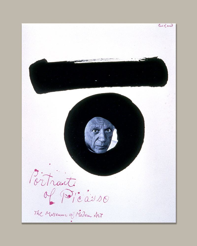
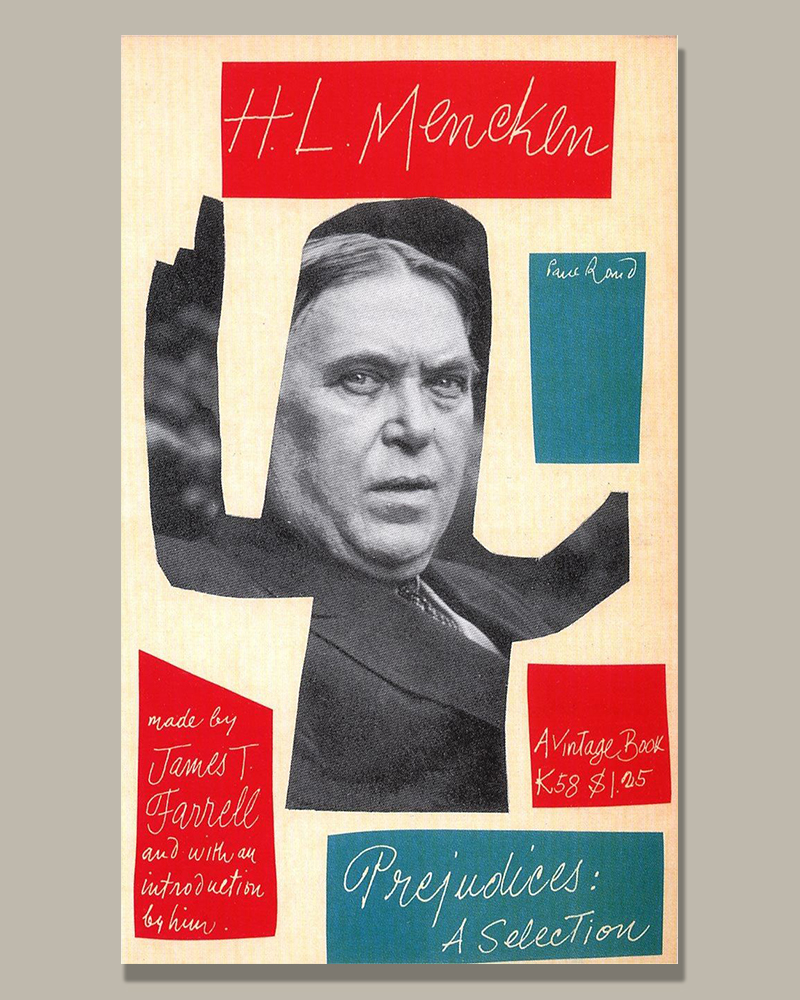
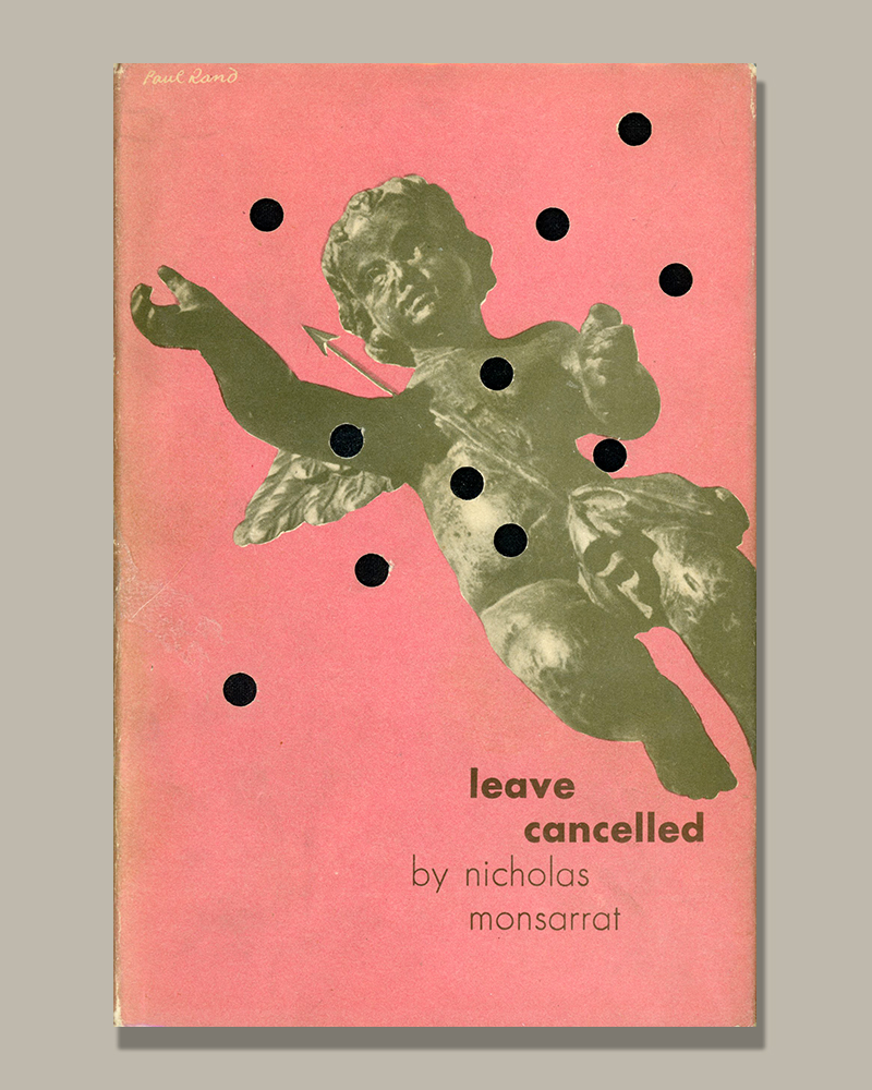
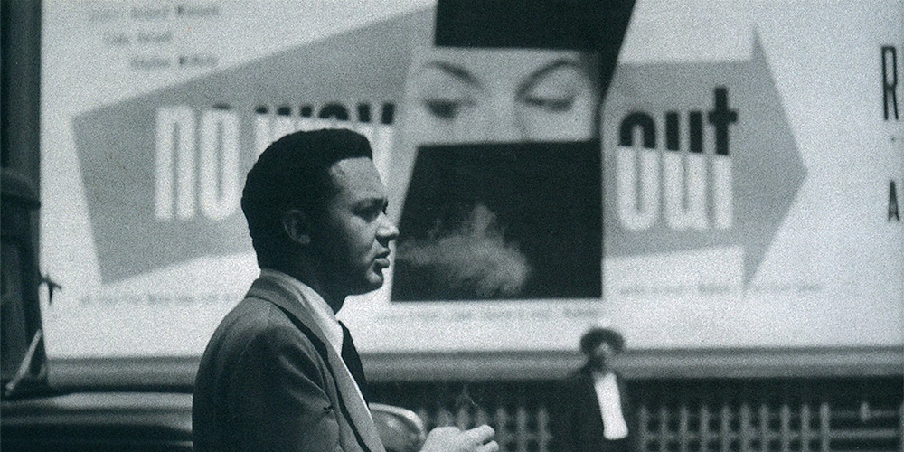
Book Covers and Posters
The same signature style could be seen in Paul’s book cover and poster designs throughout his career.
Preference, or Necessity?
We were once chatting about his distinct collage style he was famous for, when he insisted to me that it was more of a necessity than choice. He complained the photos people gave him were all awful, he couldn’t just use them straight up.
Although it is widely known Paul was strongly influenced by European artists and designers, which, I also agree, I can also believe the hatred he had for boring and/or bad aesthetics, made him have to make ordinary photos better. (Looking at some of the examples above, photos were often grainy and sometimes not properly lit.)
But then, I also do wonder from time to time, if Paul partnered with a great photographer from early on in his career, would he ever had been able to develop and perfect his signature style?