Back in the early 90s, Paul Rand, along with several other top design firms at the time, was commissioned to redesign American Express‘ corporate identity program. To me, it was an interesting lesson in how a large corporation operates sometimes, and the episode stuck with me.
A Design Shootout
This design ”shootout” happened right before I started to work for Paul. Thus, I don’t remember the full story first-hand, but I think he mentioned that there were four or five more group of people who were hired to compete on the same project. Other firms involved were probably the likes of Landor Associates and Chermayeff & Geismar (now Chermayeff & Geismar & Haviv).
I also think Paul charged his usual quarter-of-a-million dollars for this project. So upon a quick math, I calculated American Express spent some $1 – 2 million on the designers alone. With inflation, it would be double that today.
Paul’s Design
Paul’s logo presentations can be seen here at: paulrand.design
Some of his big ideas were:
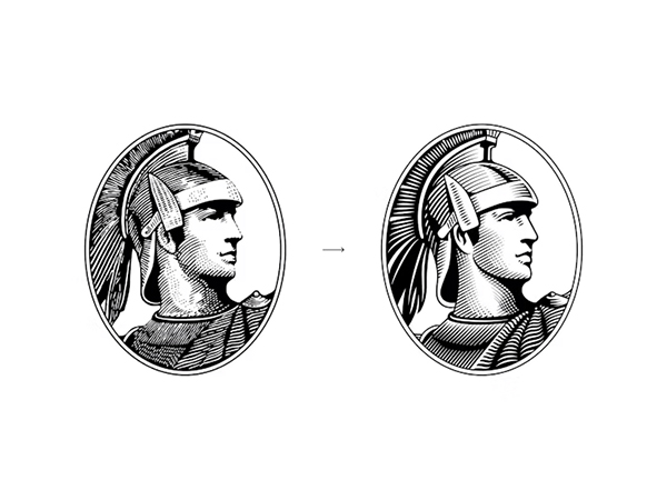
1) Combine the recognizable Centurion with the blue American Express box and use them everywhere, to try to reduce the scattered identity
2) Move on from blue square to the tilted rhombus shape, and simplify/modernize the Centurion
3) Shorten their long company name to AmEx
Paul thought that the rhombus shape would be more memorable than square
He pushed for American Express to shorten their long name
...and the winner was...
I may have taken a glimpse of some of other designs that were presented by other firms, but I can’t recall them at all. Nonetheless, American Express ended up not going with any of the proposed designs. The main reason Paul was given was, that it was going to cost them too much money to change their entire identity system.
When I heard that, the first thought that came to my mind was, well, they couldn’t figure that out before they spent all the money and time and resources?
The absurdity was shocking to me at the time, and it stuck with me. But along the way, I’ve also seen other blemishes in large corporations, like Tropicana’s redesign fiasco in 2008, and Gap’s regretful logo introductionin 2010, to name a few. Large corporations have large buffers, and they can often take big hits. Although, a loss is a loss.
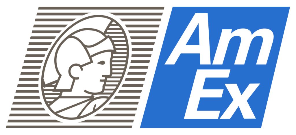
American Express Today
So a couple of million at American Express was probably just a little blip in their long history, and most people probably won’t even remember it.
Nonetheless, it is interesting to see American Express’ identity program today. It seems like Pentagram updated the system in 2018, making the brand have a more cohesive look. Although the execution is different, some of similar thoughts Paul had can be seen in them. For example: 1) Having the option of using “AMEX” in a square box, which could be reduced quite small and still be recognizable, even on mobile devices, and 2) A cleaner, more simplified Centurion that looks more updated and can also be used at smaller sizes than the older, more traditional version.
Overall, I think Pentagram did a nice job updating and unifying American Express’ corporate image, without abandoning their assets they already owned. Maybe not exactly ground-breaking, but that’s sometimes exactly what a company needs and/or is ready for. (Although, I have a feeling Paul would disagree if he was around.)