Things I learned from Paul Rand: 23 – Close Enough
Things I learned from Paul Rand: 23 – Close Enough
As intense as he was to try to get exactly what he wanted in design layouts, a phrase Paul Rand often used was, surprisingly, “close enough.”
Even at Rhode Island School of Design Graphic Design program, most of the teachers taught us to spend hours on end trying to perfect every little detail. But for Paul, as soon as a design got into the ballpark he wanted to be in, he seemed to have very little interest in sitting around and trying to polish small details. Even when I wanted to try to push the details, he would tell me, “close enough, don’t touch it.”
UPS logo
The original UPS logo that Paul designed was, dare I say, typographically incorrect. This was a detail I believe Inge Druckrey first told me in her typography class. But she was absolutely right. (I did have a chance to share this detail with Paul at one point, but he didn’t seem amused by it.)
Paul Rand's original UPS logo
The thickness of "p" is different from "u" and "s"
The other detail with his UPS logo we can improve, is where the ribbon is tied, it becomes too heavy. It would make it cleaner and read better at small sizes if we increased the negative space just a bit.
Paul Rand's UPS logo if the fonts were more consistent
Paul Rand's UPS logo quickly cleaned up.
Once cleaned up, you can see that the logo holds better as a unit. But perhaps more of a “feeling” more most audiences than something they can see and understand.
The two versions of UPS logo side by side
USSB logo
One of Paul Rand logo design process I got to work on and witness first-hand, was the USSB logo. The client first approached Paul for their company logo when their company was called HUBTV. But crazy enough, they decided to change their company name AFTER Paul presented them with the final logo (on lower left).
I thought Paul was going to freak out, because I assumed we had to start the process all over again. But instead, Paul stayed pretty calm, and noticed that the logo would still work with the new name, USSB (United States Satellite Broadcasting). So we replaced the name, adjusted the colors, and represented the logo to the client (on lower center). It was, “close enough.”
Then, for some reason, they decided they wanted to use yellow, black, and white as their corporate color. But this time again, Paul stayed calm and just found a combination he liked (on lower right). They ended up using it. (Although, they did get bought out by DirecTV within five years.) The logo, to Paul, stayed “close enough” throughout the process.
Photography and Retouching
Especially in hindsight, Paul didn’t seem too big on photography. On several occasions while working on his last book, Paul didn’t let me or anybody finish some of the photos. First of all, I wasn’t a trained retoucher, and was just one year out of school when Photoshop was still relatively new. (I’m aging myself here.) But in addition, he just went ahead and printed the versions I thought was just for a quick sketch, as the final versions.
The quick work, was again, “close enough.”
Paul only let me do one pass on creating this silhouette
Obvious Photoshop job -- I can't remember if this was me
Even with his own portrait, he didn’t seem to bother to hire a photographer, and often just used a photo his wife or a friend took of him, seemed like. On top of it, the photo wasn’t properly retouched, like this example:
Back cover of "A Designer’s Art" -- a pretty rough photo
Imperfection, Character, or Both?
I think one could argue, that his imperfections added distinct character and flavor to his work. (Especially when it came to his distinct and wonderful handwriting.)
Some designers make a living through the mantra, “God is in the details.” But Paul made a killing with his mantra, “It is a good idea to have an idea.” Not that details didn’t matter to him, but maybe the really small details.
I’m hoping my take to him up there would be, “close enough.”
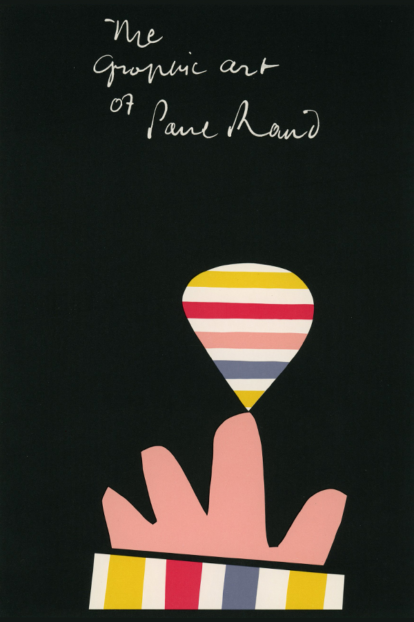
This could easily read, "Me Graphic Art..." but who cares?