Accent Software International, established in the early 1990s, specialized in multilingual software products. Paul Rand was hired to create their logo when I worked for him.
Constant Challenge
Before I get into a little story behind this Accent logo, I want to paint a little background: Paul loved to constantly challenge people. I still don’t know if it was a habit he gained as a career-long teacher, or if it was just his nature to begin with. Nonetheless, working for him was filled with a constant needling from him. He often asked, “Why didn’t you think of that?” when he came up with what he thought was a good solution or an improvement of a design.
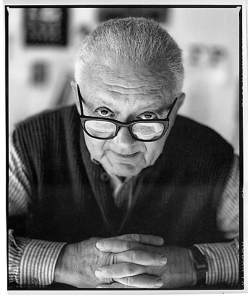
This portrait by Peter Arnell captures the look Paul had when he challenged me, which was all the time.
Will he notice?
Right about this time, when I was getting tired of feeling like a dummy all the time, I was working on Paul’s Accent logo presentation deck, when Paul had to leave for the day (for something like a seminar at a design school). After working with what Paul thought was the final version of the Accent logo for few hours, the location of the word “Accent” was bugging me, I decided to try to shift it to the outside of the logo from the inside.
This felt much better to me, and I was almost convinced this is what Paul would do, too. But then, I thought it might be fun to play a little game. I decided not to tell Paul I did this, and kept on working on his deck as if nothing had happened.
Something felt off about the placement of the font
Small change, but felt a lot better
"What did you do?"
Paul returned later in the day. As usual, he came and sat right behind me as I worked away on his computer. It only took few seconds until he bursted out, “What did you do?”
I was quite nervous here. Would the master be offended that some arrogant young punk altered his design? Or, would he school me for making a bad move?
But then he just continued before I could even respond, “So you moved the name.” He definitely noticed, and seemed to enjoy playing a detective.
Then, he asked, “Why did you do that?”
I told him, “I thought the negative space around the type looked much better.”
He didn’t respond for few seconds, which felt like a long time. Until he finally said, “Negative space, huh?”
If I remember correctly, that’s how this conversation ended. He didn’t argue with me nor did he congratulate me. But he did look a little amused. Maybe he thought I was finally catching on. Maybe he thought I was lucky. But this logo did end up being the final version, that was used by the company that lasted until the late 90s.
One more tweak?
This is completely after the fact, but I’ve been wondering over the years, if we should’ve added a little separation between the blue part and the flags part, so that the idea of “accent” was a lot clearer, too. I wonder if he would’ve agreed.